Client
Nest Pension
Role
UX/UI Designer
Duration
6 months

Overview
Millions start saving with Nest without ever logging in
In the UK, employers have to automatically enrol eligible workers into a workplace pension, and for millions of people that provider is Nest. Because enrolment is automatic, members save every month without ever creating an account. Their first real interaction with Nest can come years later, when they try to register online. The details Nest holds about them may be wrong, out of date or tied to a job they’ve left.
The Problem
Friction across registration and login, and a lack of contextual help and support was driving drop-off and calls
Registration and login was one of the most common and costly reasons for calls. Members who never registered were also less likely to engage with their pension, update their details or combine their savings. That left more duplicate accounts and out of date records.
Nest’s records didn’t match member data and members couldn't access their ID
Typos blocked registration, and led to duplicate accounts for the same person, the Nest ID letter was the only way round a mismatch, and most members had lost it.

The Discovery
Mapping backstage processes and analysing data to uncover insights
As-is Blueprint Mapping • Heuristic Review • Data Analysis • Competitor Benchmarking
I analysed quantitative and qualitative research to identify the highest-priority issues, mapped frontstage and backstage processes in deep-dives with business analysts. Followed by a heuristic review to pinpoint where the flow was breaking down and identified common patterns across competitors and other financial products.

User Research and Testing
Members’ mental models assumed enrolment meant they had an account - so they expected to log in
Being enrolled made members think they already had an account. They thought they would Log in, not Register. We changed the language across the flow to match how members saw their situation. “Register” became “Set up your online account”, and the entry page now explains that members are already saving with Nest.
The delegate account type was misunderstood
Framing the option around a delegate email invitation led to confusion around the role it was for. This led to changes in language, CTA and the card treatment to make it a clear choice alongside the others.

The Solution
Multi-path registration routes
Working with Compliance and Security, we agreed secure verification routes that let members recover from errors on their own.
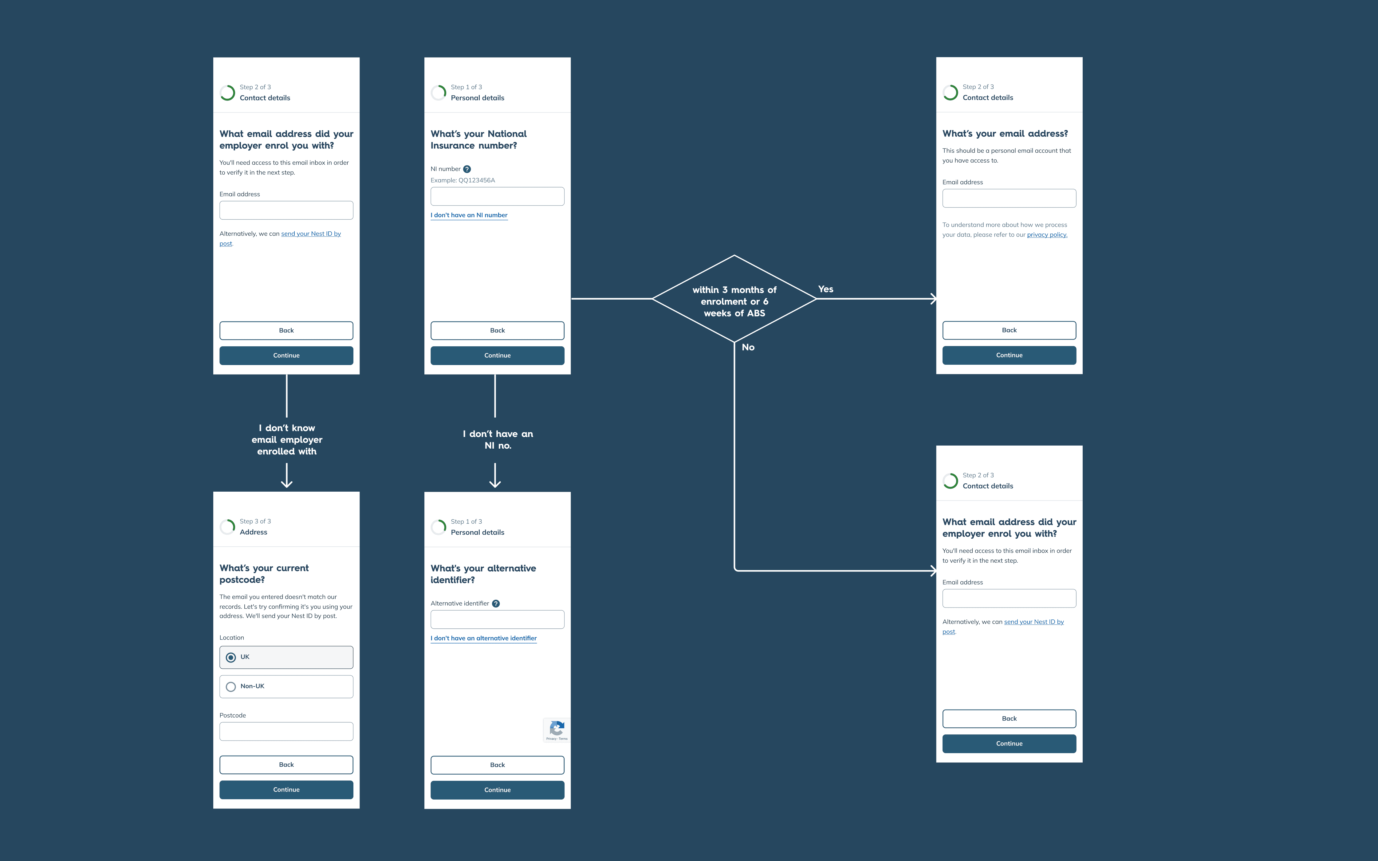
Clear messaging at every point of friction
To help users understand, diagnose and recover from errors, every message explained what went wrong, why, and what to do next, in plain language.

Progressive disclosure to reduce cognitive load and limit exit opportunities to support task completion
We stripped navigation and secondary content from the registration flow, so each page had one clear action. This reduced accidental exits and kept members focused on a task that needs their full attention.
Categorizing instructions into stages helped mitigate the cognitive load of seeing all the form fields at once. By presenting only the information and fields relevant to the current step, the flow feels more manageable and easier to navigate. Chunking makes the task feel achievable. It creates a sense of progress: Moving through distinct sections gives users a clearer feeling of advancement towards completion.

Requesting updated data once they completed registration
Members had just got access, so this was when they were most likely to act. It also replaced out-of-date employer data, like inaccessible work email addresses, so members could recover their account on their own in future.

Results
50% reduction in registration and login related enquiries
70% reduction in journey times
Data post going live highlighted the significant impact the redesign had on the member experience.
Learnings
Working within security and system constraints
Every design decision had to fit what Security and Compliance would approve and what Nest’s back-end systems and APIs could actually support. Some ideas weren’t technically possible, and others were held up by how data moved between systems. Working closely with Security, Compliance and engineering from the start meant we found solutions that were safe, workable and still simple for members.
Designing for the unhappy paths
On paper, registration was a straightforward journey. In reality, incorrect or missing data, lost letters and inboxes members could no longer open provided several problems. Designing for these real-world scenarios made the biggest difference to people accessing their money at an important time in their life. The project reinforced the value of designing for imperfect scenarios. Clear guidance and thoughtful validation helped make a highly regulated, security-heavy process feel simpler, clearer and more trustworthy for members.